CS50w — Lecture 0 notes (html, css, responsive design, boostrap, sass)
16-Dec-2021
HTML

line 1: doctype declaration — telling browser the version of html used
After line 1, all elements are nested within the html element and their structure are series of nested HTML elements
line 2: start of html content — line 9: end of html content
line 2: html attribute lang= ”en” ← helpful for search engine
line 3: head → information useful for browser (not shown to user)
line 4: title of the page
line 6: body → visible part user can see

Common html tags and html elements
Headings — h1~h6 tag
list — ul (unorder list)/ ol(order list) ← items in both are li (list item)
img — image (with attribute alternate text for inaccessible case)← self embed (no content inside)
additional attribute — width
link to other page — a href (anchor tag)
table — thead — tr— th
— tbody— tr — td
form
— input type=”text” placeholder name ← to find the data using this name
— input type= “submit”
— input ← there are more types, you can explore
— input type= “password”
— input type= “radio”
— input type = “list” ← the one I know is type= “select” ← i guess same effect?
division of the page→ div — a box containing the content → no special meaning


CSS — style of the web page (how the web page look like)
put the style in element tag
If you wan to apply on every element under the parent → you can apply on the parent element
If there are a lot of changes, might be a lot of copy and paste
→ put it in style under head
select the tag / class/ id that you want to change and input the desired style
What if many pages style the same look?
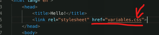
→ link them to the same css file under head
<link rel= “stylesheet” href= “file.css”>
Most common css
background color
width
height
padding
margin
font
color
font-family
font-size
multiple element selector: using “,” to state the selector you would like to apply on
#id selector /////////////// .class selector


ol
ul
/ul
/ol
CSS selector
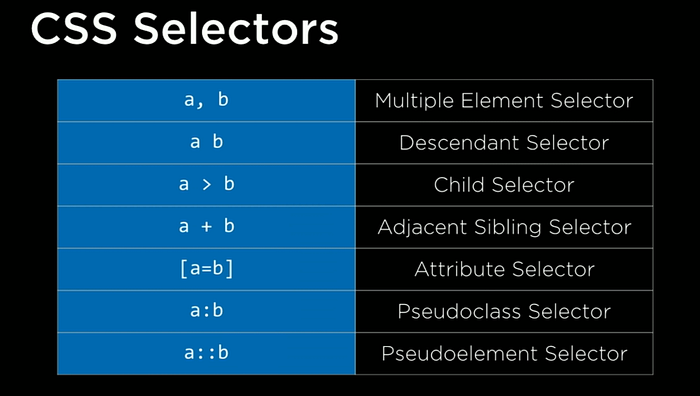
a> b← only the “direct ” child under a should be chosen
a b ← all the children under a
pseudoclass selector a:b ← a:hover
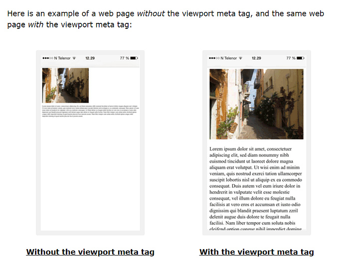
Responsive design → no matter what device user are using, make sure that they could access to webpage in a good way

viewport — visual part of the screen that the user can see
Change the webpage according to the viewport


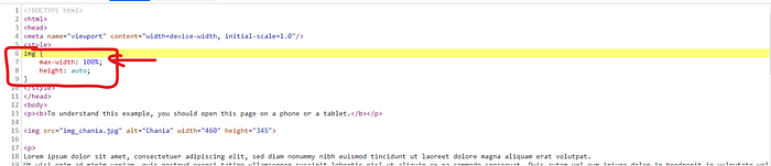
max-width:100%; and height : auto;
the text size also differ as the screen size differ
As phones’ browsers may load the page like computer, their may use set the width of webpage like computer, you need to specify the width of device equal to the width of viewport
https://www.w3schools.com/css/css_rwd_viewport.asp
Media Queries
How the page is going to look depending on how we render the particular page (browser) or the screen size we render that page on or even what type of browser we are using

If the size of the screen width is this, then…
If the size of the screen width is this, then…
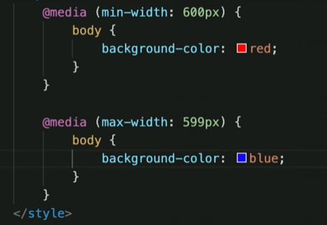
For above , if the screen is larger than 600, then red; if smaller than 599, then blue.
display property ← control the element is visible or not
vertical / landscape mobile // print out of the page
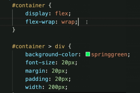
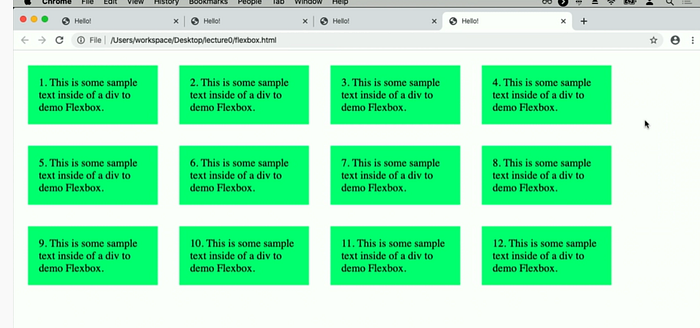
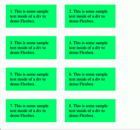
Flexbox
let the items wrap if the width is smaller
Grid layout
grid-column-gap (straight gap between column)
grid-row-gap (straight gap between row)
grid-template-columns: 200px 200px auto ← how many columns and width of each columns
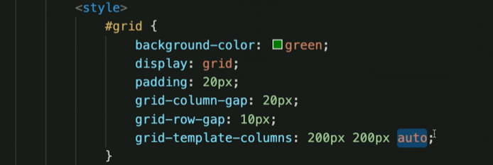
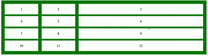
Third column will auto fit the size of browser
Bootstrap ( bootstrap.)
If you apply the correct attribute to the element, the things will work out themselves.
Bootstrap mobile columns (grid system)
Browser was cut into 12 units, each of them are worked as one unit.


lg// sm ← large screen// small screen ← the size of the div according to the screen size
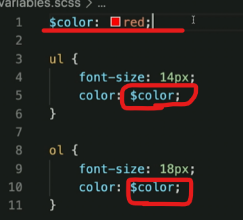
What if I want property same for different element? — SASS

remove the redundancy
!!!! creating variables
.scss ← file name
- create variable → $color: red;
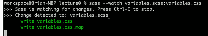
browser does not understand sass, so translation from sass to css is important.
you need to install sass to compile sass to css

Why sass but not css?
https://sass-lang.com/documentation/variables
“CSS variables are included in the CSS output. CSS variables can have different values for different elements, but Sass variables only have one value at a time. Sass variables are imperative, which means if you use a variable and then change its value, the earlier use will stay the same.”
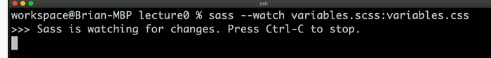
Make the compiling faster → automatically recompile the changes
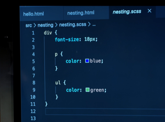
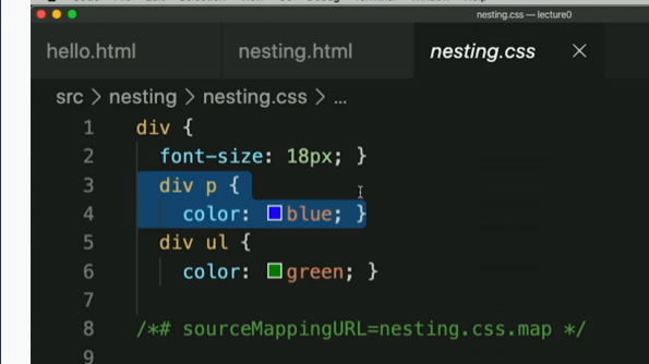
2. nesting is allowed
3. inheritance
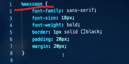
%message → generic message ← sth to extend later
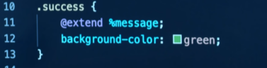
with class of success ← inherit the thing in %message